Written by Topology, on behalf of Essential Living
Here at Topology we, like Essential Living, thrive on beautiful design and know the importance of every living space being unique for our tenants.
So what better way to encourage self-expression and embrace personality in your rental home than by installing a stylish gallery wall? However, when it comes to putting together a gallery wall, it can be daunting knowing where to start. Colour, design shape layout - it’s hard to know where to start! Additionally, we want it to look eclectic and fun, whilst at the same time appearing cohesive and well designed. So how do your get creative and construct the perfect gallery wall? Read on for our top tips…
Stick to a cohesive colour palette
Perhaps you love a pop of colour? Or maybe neutrals are more your vibe? Choose a colour theme for your gallery wall and be strict about sticking to it. It will make for a much more ‘put together’ feel and will appear more ‘designed’ than ‘thrown together’. Typically choosing 3 main colours as a base works nicely for a gallery wall. This prevents it from being too chaotic. But from within these 3 colours you can choose further tones e.g. if blue is a main colour, you can pick teals, navies, sky-blues etc. This way you’ll get a lot of depth without the business of clashing colours.
Top Tip: If you have personal photos that are ‘must-haves’ for your gallery wall, but the colours are all wrong, why not try printing them in black and white? This way, they will blend in with any theme.
Use a variation of styles
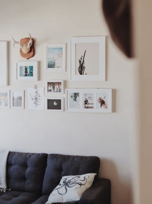
Choose a combination of art styles. For example mix a few personal photos that fit your chosen theme with other art forms, such as prints, photography, paintings, hand drawings and text imagery. This variation of styles will attract the eye, demonstrate creativity and make the design more aesthetically striking for the viewer.
Top Tip: If you want to add further interest try breaking up the gallery wall images with a tangible object - something like a plate or mirror works well.
If you’re buying new art: use paper templates to lay out your design
This is an important step to take if you are struggling to come up with the layout of your gallery wall and want to ensure it all works well together (and will fit into your space).
Use scrap/recycled paper to create templates of the size of all of the frames and then tack them to your wall in the desired layout. Then, stand back and assess. If it’s not quite working, you can switch around the pieces of paper until you come up with the perfect display.
If you’re using existing frames: lay them on the floor first
Alternatively, if you’re using existing prints you already own, lay them on the floor and play around with layout combinations until you’re happy. Take a picture so you can refer back to it and ensure you measure the distances/gaps between the frames as well.
Use a variety of sizes
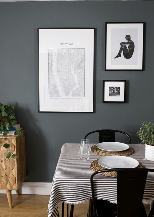
Create an interesting visual display by playing around with the size of your pictures and art. Try working with large prints and combining them with smaller cards or postcards that you love. Or maybe you have a text print which deserves a larger frame and an oversized mount? By playing with sizing, you are creating interest and are one step closer to the perfect gallery wall.
Renter friendly
If you are renting your property such as an Essential Living property, and can’t readily commit to knocking nails into the wall, then why not use temporary picture hooks - such as ‘Command hooks’ - to hang your art?
These are a versatile tool which allows for hanging your artwork on sturdy hooks that stick to the surface of the wall, so you have the option to take them down at a later date or reposition them damage free!
Know when to stop
As with all projects, it’s important to know when to stop. Gallery walls are no exception! So if your gallery wall looks amazing with 7 pieces of art, then go ahead and get them up. If it’s making an impact with just 3 pieces, then that’s great too. There is such a thing as going overboard and overwhelming an area, so make sure you’re finding a good balance which complements your space.
So, there really is an ‘art’ to creating the perfect gallery wall. Hopefully, though, these tips have given you a little more confidence to let your creativity run wild in your rental pad. If you follow these guidelines, then it won’t be long before you have designed something both personal and stylish.


